THE NEW CITY COLLEGE LOGO, featuring three archways side by side sitting atop a foundation, has officially been introduced to campus.
Recently announced by President Kathryn E. Jeffery, the new logo is the product of a lengthy design process that began in early 2009, according to Amanda Davis, communications and public information officer.
According to Davis, the new logo was one of many created by student designers as part of a collaborative effort with the Marketing Team and the Public Information Office over the course of a year to create a unique design that properly mirrors the goals of Sacramento City College.
The finished designs were presented to a number of constituency groups(Classified Senate, Academic Senate,Associated Student Government, SeniorLeadership Team), and input was sought from the entire campus community to choose the logo that could best represent the school, said Davis.
The previous logo was of a horse-drawn, pioneer wagon and, according to the Sept. 27, 1976, issue of the Express, “The wagon emblem had never really been lost. Students who graduated with honors received special seals on their diplomas designating the honor. On the seal was the Conestoga wagon.”
“They keep updating it,” said Caroline Harker, City College library archivist, who said she liked the old logo but added that it has changed every so often as “…part of marketing.”
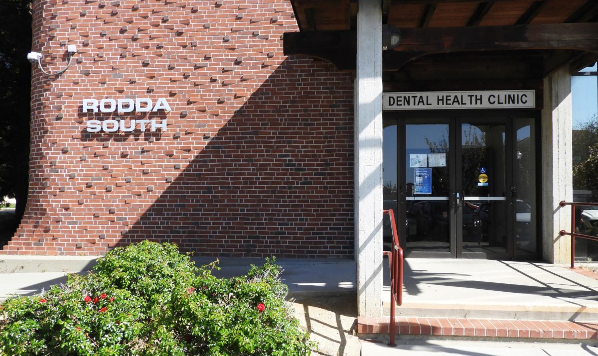
The new logo, according to the City College website’s Style Guide, is meant to bring to mind the “widely recognized” architectural design of the Rodda buildings located on campus.
The Style Guide says that the logo represents a sturdy foundation, “and the gateway to higher education that City College offers to students in the region.”
Student organizations that have been approved by City College can also take advantage of the new logo in their flyers or websites to show their position as an officially recognized organization.
“It has a nice, simple design,” said Sirchristopher Crittenden, accounting major. “It almost looks like the Doctor Who symbol.”
The logo has a “traditional feel” to it, according to the Style Guide, to properly reflect the City College brand and its desire to provide its students with a firm tradition of excellence.
“A clear message and consistent visual identity reflect our diverse, but unified, organization,” states the Style Guide.
“In today’s hyper-visual world, a modern marketing and branding approach is imperative to project a high level of professionalism and trustworthiness,” said Donald Button, a professor of graphic communication who was on the logo committee.
More information about the logo and its history, as well as high-quality variations of the logo and proper placement of it, can be found on the City College website Style Guide, in the Faculty/Staff section under Manuals & Handbooks.


