City College website has received a makeover and now features a new interface, easier to navigate sections and an responsive design that will allow viewing on cell phones and tablets to resize the website for a more intuitive experience.
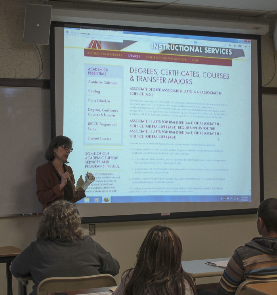
During March, the website design team hosted informational forums where members of the design team demonstrated the use of the new website, answered questions and made notes on improvements provided by attendees in an effort to introduce City College’s new online look that officially went live March 31.
The design team, made up of students, faculty and staff included Don Button, City College graphic communication professor and lead faculty designer, Amanda Davis, City College public information officer and Elaine Ader, dean of Information Technology.
Ader explained that the structure, design and content has been changed and updated to meet the needs of as many users as possible. Ader said that the content is divided into categories and the pages are designed specifically for certain types of users or for specific information needs.
For example, each page has an “essentials” section.
“The idea of the student essentials was a direct link to something we thought [students] might need,” said Ader.
Stemming from an accreditation recommendation, the website redesign project began in 2012. The recommendation was not specific, but Davis said the spirit of the recommendation was to make the site more user-friendly.
“I think they wanted just for it to be easier to use, easier to find things, easier to navigate,” Davis said.
Davis said the process began by evaluating the previous site and identifying the biggest areas of focus by talking to faculty, staff and students about what improvements could be made.
“From a technical side,[the project started by] exploring content management systems that our infrastructure and our organization in general could support and that would be compatible with our other technologies,” said Davis.
A committee was put together to make these decisions, according to Davis.
“[The] decision making process is collaborative and inclusive here,” said Davis. “Before deciding, we needed to have meetings and conversations.”
Those in attendance at the March 26 informational forum witnessed firsthand the complexity of decision-making process for designing a new website.
Just days before City College’s new site launched, in a demonstration some of the decisions about the site’s layout were still being worked out right up to the launch, present members of the new website’s build team discussed whether the link to the library should be listed as a Campus Service, an Academic Success Program or as a Student Essential.
“There could be an argument made for almost every program on campus that it’s an academic success program,” said Davis. “And while [the library] does contribute to academic success, I think externally people see it as more of a service.”
It might seem simple enough to place the link in two or three places on the site, but Davis pointed out the importance of avoiding the mistakes that made the previous site not as user friendly as it should have been.
“It’s kind of how we are structured right now with our current site, which is if people don’t know to look for it here, we’ll put it everywhere and then you have this proliferation of information about everything, and it’s really hard as a visitor to the site to sift through that,” Davis said.
According to Ader, the design team was not just concerned with what information would be accessible and how, but to design a site that accommodates different computer types as well.
“We recognize that this site is going to be seen on desktops, laptops, tablets and phones,” said Ader.
Davis agreed that certain aspects of the site—such as being responsive— were designed to accommodate modern technology.
“The responsive design structures the site to be user-friendly for any size screen,” added Davis.
That responsiveness, which originally seemed like a “cool” feature, according to Davis, has turned out to be a significant factor in the site’s usability.
“Now the more we are demonstrating the site and talking about it and talking with other people who are looking at their sites, I think it’s a really key feature,” said Davis.
Ader explained that the responsive feature would not apply to some of the sites that are linked to the main website. Some links are provided on the new website to the sites that have critical information and services, such as the Los Rios district site and the athletics site, which are not being redesigned at this time, she said.”


