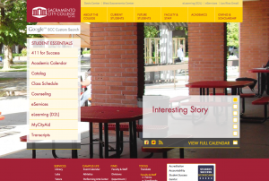
A team of faculty, staff and students at City College has been working since the fall of 2012 to deliver a new and improved version of the scc.losrios.edu website during the spring 2014 semester, said graphic communication professor and integral team member Don Button.
The new site will be responsive, among other many changes and upgrades, meaning that when it is opened on a mobile device, the site will resize itself to the user’s screen size, said Button.
Button, who worked on the site over the summer and is on sabbatical this semester while finishing it, said the biggest challenge is trying to find enough time to get everything accomplished.
“Our goal is to have the bulk of it, all the student services and the divisions, up and running,” said Button. “It’ll still be in beta through spring.”
The main focus of the redesign was to make the site easier to use for students in response to a recommendation by the accreditation committee, according to Amanda Davis, City College public information officer.
“It sparked the need to look at how our navigation is working,” said Davis. “So this web redesign team was pulled together, and we started looking at what we already have.”
Button explained that the original goal was to launch the new site in January, but because of a recent accreditation deadline change and concerns about launching during a busy time for site traffic, the site is now slated to launch in March.
“We realized switching the site right as the new semester was starting, when people might still be registering for classes and such, would probably cause more disruption than we thought initially,” said Button.
Along with Davis and Button, the team consisted of Quinn Nakano, reprographics programmer; Elaine Ader, dean of information technology, and Aaron Winters, adjunct graphic communication professor. The team planned and designed the look and features of the new site with the help of former City College graphic communication student Chris Hopkins.
Hopkins said he was asked to join the committee by Tom Cappelletti, City College graphic communication professor.
“I was the only student there,” said Hopkins. “There [were] a bunch of faculty members and then me, and we had all these discussions on the website. I was the student voice of that.”
During the design process, Hopkins worked with Button and Winters to map the current site, identify what content should be carried over and what was unnecessary.
In spring 2013, after the site was mapped and the final design was chosen, work on the site began. Button explained that the choice to use the WordPress platform, which, according to Wikipedia, is a “free and open source blogging tool and content management system,” was made because of its universal ease of use.
“We chose WordPress because it’s just the biggest, most popular, easiest to learn and powerful content management system,” said Button. “It’s worldwide and it’s also essentially free, compared to paying thousands of dollars a year for a proprietary system.”
Button added that part of the overall project is to help train the people who will be responsible for updating their individual content in each department. The site was designed to make this process as painless as possible, he said.
“We’ve got a set of templates, and so there’s not a lot of room for individual creativity within the site, but we’re sort of focusing on keeping the visual presentation sort of clean and unified throughout all the sites,” said Button.
The reason for making the site more uniform is because the current site has a lack of continuity among the departments, according to Button.
“Our current site is sort of a mess in that way,” said Button. “There’s too much variation, a loss of sort of a brand identity for the school.”
Button said that the key has been working with the departments about how their content is organized.
“This way every department that a student goes to is going to be organized in the same manner,” said Button. “They’re going to know where they get the contact info; they’re going to know where they can go to find out about the program.”
According to Winters, though he isn’t currently working on the site, his main concern in the beginning was to create a layered feel to the information on the new site.
“The way that it exists now is that it’s just very flat,” said Winters. “There’s no real hierarchy to any of the information. [We] tried to create more of a pyramid than a flat structure.”
Ader agreed that the new website will make the process of finding content smoother for users.
“We wanted to make sure the available information was easier to find,” said Ader.
Other new features will include a refined and more accurate search function, a redesigned library site, a universal calendar system and a home page that will highlight news and important campus information, Button said.
A focus going forward, according to Davis, will be to assemble focus groups to test the new site and collect feedback in order to continue refining the user experience.
“We’re going to be testing this with students,” said Davis. “[We’ll] do some focus groups with students, with staff and faculty…sit people down and say, ‘You know, here’s the new website, here’s a scavenger hunt, look for these things. Did you have trouble finding them? How did you find them? Did you use navigation? Did you use search?’”
Davis added that it’s important to stay current with industry standards in terms of what is user-friendly.
“You don’t build a website and then say, ‘OK, we’re good now,’” said Davis. “The technology, the user experience is constantly changing.”

